

8 Great Examples of Companies Using the New Google+ Cover Photo
Google+ recently unveiled their new, large cover photos for profiles and pages.
While this feature isn’t yet mandatory, my hunch is that it will be in the near future.
In addition to the new, large cover photos (up to 2120px by 1192px), Google+ also added a couple of other new features: A new tab for your Local reviews, and the ‘About’ tab now consists of separate cards (like Story, Places, and Links) — each with its own prominent edit link.
The larger photos, which when clicked on will display in a 16×9 format, are supposed to give users and pages more options when choosing cover photos.
“This way more images can be used as cover photos, and there’s more room for your selection to shine,” Googler Sara McKinley wrote in a Google+ post.
The old cover photos were either very long and skinny or you could choose to have five separate but normal-sized photos.
8 Examples of new Google+ Cover Photos
Suprisingly, not many people have switched over yet, so these were actually pretty difficult to find.
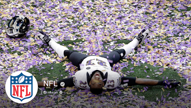
The NFL
 The NFL shows off a player from the Baltimore Ravens celebrating their win in the 2013 Super Bowl.
Taco Bell
 Taco Bell is doing a great job at utilizing social media to create buzz for its new Doritos Locos Cool Ranch tacos, and it’s not surprising that it’s their feature photo here.
DIY Network
 If you follow any of DIY Network’s social media channels, you’ll know that this photo is right up their alley in terms of how they’re utilizing social media.
Staples
 Floating “Easy” buttons. Nothing difficult to explain here.
The White House
 Interesting to see the White House as an early adopter of the new cover photo. But I think they chose well with this gorgeous shot of the White House in the wintertime.
HubSpot
 HubSpot chose to use their real estate to feature their team; not a bad idea as it gives the company a personal touch and feel.
ABC News
 A nice candid shot of some of their anchors on set. The image could be a higher-res photo, but something about the pixelated photo makes them almost feel “human” to me.
Design World
 It wouldn’t be a “X-number of examples” post without a shameless plug, would it? Design World is WTWH Media’s flagship publication and is worth your “+1” 🙂 .
What do you think of the new Google+ cover photos? Let me know in the comments.
-Lance Brown


Pingback: 4 Common Social Media Blunders Every Company Makes |
Pingback: 4 Social Media Blunders Every Company Makes (And How to Avoid Them) | Social Media Strategy Plan