

New Twitter Design and Layout
Twitter is Testing a New Design
At a recent team meeting we were discussing new changes in the social media world, and Twitter’s new layout was a hot topic.
When I complained about how drastically different my profile page was and no one shared in my complaint I was slightly surprised. When I turned my laptop around to show the rest of the team my profile they were all shocked because the changes occurring to their profiles were less dramatic.
Twitter has selected random accounts to test out their new layout and I was one of the lucky few!
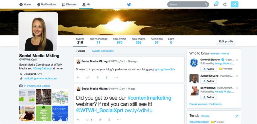
What does the new Twitter layout look like?
-Larger Photos: Every single photo is larger with the new Twitter layout. The entire top of your profile page is dedicated to a very large cover photo (1500 pixels by 500); similar to Facebook’s cover photo, the Google+ cover photo and the banner image on a YouTube channel. The background themes and photo options are gone leaving only two photo opportunities to brand your page. Also, photos that are tweeted will appear in the newsfeed automatically and are larger than usual.

-Larger Profile Image & Bio: The profile image has shifted to the left of the page and is also larger. The bio is also on a solid white background making it easier to read.

-Larger Tweets and Popular Posts: Some of my tweets were appearing larger than others. All of the tweets in the feed are larger at a size 13 font. Possibly one of the most drastic changes are tweets with re-tweets or favorites are oversized at 22.5 size font.

-Mini Profiles: Looking at who you are following and your followers is very different. Instead of a list of accounts you can see a mini profile showing a larger photo, their bio and their cover photo.

How will the new Twitter layout affect social media marketing?
If this new Twitter layout is applied to everyone’s accounts eventually there will be some changes in how we use Twitter for social media marketing.
One of the biggest differences will be the importance placed on engagement for each post. Any post without any form of engagement such as a comment, re-tweet or favorite will be shown significantly smaller than a ‘popular’ post. Social media marketers will need to ensure that they are posting quality tweets in order to increase engagement on all of their posts since it will be obvious if a post was not ‘popular.’
Since tweeted photos will appear automatically in the newsfeed and will be larger, it is more important to find photos to tweet. Twitter’s new design is more visually appealing so we should be posting to Twitter like we are to Facebook, but more often. This might be hard if you like to schedule your tweets out using a platform like TweetDeck which does not allow photos in scheduled posts. There are other platforms like HubSpot and HootSuite where you are able to post photos in scheduled tweets.
Another aspect of Twitter trying to focus more on the visual is getting rid of the background photos and having a larger cover photo. While getting rid of the background photo lessens the promotional photos for B2B or the ability to personalize pages for consumers, it will make profile uniform and easier to read without a distracting background. One positive of the new cover photo is that the bio does not cover it now; this allows photos to have easy-to-read text. Marketers will want to make sure the are choosing a high-quality photos for their new cover photo.
My compliant is not that Twitter is changing their layout, but that all of my social media platforms are beginning to look the same. Twitter is putting more of a focus on photos making it look more like Facebook. If all of the social media platforms eventually not only look alike but share the same features and functions, what is the point of having different platforms?
Does your Twitter have the new layout yet? What do you think of the changes?
UPDATE: Another new feature Twitter is testing out are ‘pinned’ tweets. If you had a great tweet that you want to have more exposure this can be ‘pinned’ to remain at the top of your page. The ‘pinned’ posts are similar to Facebook’s ‘Pin to Top’ option, which keeps a post at the top of the page for a week. ‘Pinning’ will be great for brands running a campaign because instead of creating repeated tweets and risking annoying their followers they can circulate ‘pinned’ tweets for exposure.
These ‘pinned’ posts are just another aspect of the new Twitter design be very similar to Facebook.
Follow Carli at @WTWH_Carli.

Any idea how you can change to the new layout? Or do we just wait for Twitter to offer it? Thanks!
http://www.whatisfoiegras.com
You will have to wait for it. Twitter said, we are all going to have the same layout in a few weeks.
I am sure going to miss this old one. I wish we could change the background also not just the header. Maybe they will change that for us too.
You should be able to opt in now. With the new profile you will still have a background that you will see when you are scrolling through the newsfeed page. You can customize it but you are the only person who will see it!
You are able to opt in now!
I changed into the new layout and I hate it, how can I change it back to my old twitter
Unfortunately I don’t think you are able to opt out once you change it!
I’d rather just have Twitter at this point and not have to do Facebook too — that is, I only use the both for business purposes. That’s it. Facebook is so much harder to attract followers. The only difference between the two at this point is the length of characters for the post and an easier-to-read comment system for posts in FB. Wouldn’t it be interesting if Twitter tweaks these two elements and wha-la, suddenly Twitter is the dark horse competitor to FB? That would mean FB becomes more of a private-lives social media network. And Twitter becomes the go-to public persona for business and personalities?
You bring up a good point that Twitter is better for business purposes. It will be interesting to watch the changes Twitter makes and see how close they get to Facebook! They seem to be trying to make Twitter more visually appealing but I can’t see them having photo albums like Facebook which makes me think that Facebook will likely be more popular for personal use and Twitter for business-related purposes. Thanks for your comment!
I really don’t like this new layout please how can I turn it off? I want my old twitter back, I don’t want this new twitter layout it gives me a headache plus it looks ugly I hate it please someone help me I use twitter everyday I neesd to change it back!!!
Pingback: #WLW14 World's Largest Webinar: The Secrets to Success on Social Media
The only real problem I have with this new layout is that they seem to have removed the drop-down function of clicking on tweets to see the replies/conversation chains. Instead it opens a whole new page for it.
Why did they remove such a convenient function? This makes viewing replies and following trains of thought a convoluted hassle. Going back to a profile from a tweet’s individual page take you right back to the top, forcing you to search for the point where you left off. So unless you want to scroll and reread tweets a lot, you have to open each tweet in a new tab, and I shouldn’t have to explain why that’s inferior in every way to a drop-down function.
I agree, it isn’t as convenient as before in regards to viewing conversations! Hopefully as they realize what works and what doesn’t they will make tweaks!
I LOVE THE NEW TWITTER LAYOUT / DESIGN, NOW ALL PHOTOS AND ALL VIDEOS ARE OPEN ON MY PAGE, BEFORE VIDEOS WERE NOT OPEN, I ALSO LOVE THAT IS CLEANER, BIGGER AVATAR PHOTO, IT’S GREAT !
I do like how the photos look in the newsfeed with the new Twitter! I also really like having one nice large cover photo as opposed to a small cover photo and a background photo which I thought looked a bit cluttered.
The new Twitter pages are much better and cleaner, i like it better now….Great job Twitter !
Carli Evilsizer is Beautiful !!!…..
PLEASE GIVE ME BACK MY OLD TWITTER LAYOUT! I REGRET CHANGING IT! IT’S HORRIBLE! PLS GIVE US BACK THE OLD LAYOUT!
Pingback: Twitter: New 2014 Layout - Jabbrag
It sucks that we can’t have a background anymore on Twitter if we switch to teh new layout!
this layout sucks. i want my old one back…;(
The new Twitter layout is more dynamic. The comparisons to Facebook’s design are superficial. Twitter offers a much more engaging user experience than Facebook.
I REALLY HATE THIS NEW LAYOUT HOW CAN I GO BACK TO MY OLD ONE????
Worst update from a major web company ever. I didn’t select the new layout, but something I did appears to have changed my layout to the new one. It’s so busy that it makes it difficult to see what I’m looking for. It also changes my page as others see it and that’s even worse. I’m beginning to wonder if I even need Twitter any more.
We are designers, researchers, writers, artists, and users, For us, the new format is below TERRIBLE. The font size is WAY WAY TOO BIG! If any of my design teams produced such a childish and poorly designed interface, they’d be on probation and probably let go in a few months if the didn’t radically get their act together.
It boggles our minds how many coders with such poor design skills are paid good salaries, get free lattes, or even have a job. The reality is that any one good hacker can code a messaging app as simple as Twitter. It’s popularity has nothing to do with quality. It’s just popular by having accidentally hit the froth and followed the wave. As to whether it makes the current, we’ll have to wait and see.
While the concept of messaging has always been quite good, Twitter is anything but high tech. I created something similar but with more features and a far better interface over 30 years ago. So, after all this time, why are our systems not 3 decades more advanced – rather than poorer. I guess not many care so quality forever erodes.
Hey, Twits! Please undo this fiasco. You have enough of a hard time justifying T’s existence when alternatives are so easy to code. We’re happy to pay homage to the concept by deigning to use it but, please, don’t make it any harder for us to like it. At this rate it might end up in the same cesspool as that old social rape site, F***book.
XOR42
The new layout is horrible, I feel like I’m on facebook again. Everything is super bright white, please can we at least change to a darker colour. It’s like they are trying to follow the iso 7 trend.
uggghhh so frustrating,
It’s soooo white! What’s the point in having a background image anymore? Also it’s so generic and lacks personality.